Rucad
A rebrand to move an electrical engineering company up into the big leagues Um rebrand para levar uma empresa de engenharia elétrica para as ligas maiores
A two-month rebrand for an electrical engineering company in a growth phase, built on one decision made against the benchmark: flip the industry's default yellow into a supporting role so Rucad could stand out among larger competitors. Um rebrand de dois meses para uma empresa de engenharia elétrica em fase de crescimento, sustentado por uma decisão tomada contra o benchmark: rebaixar o amarelo padrão do setor para papel de apoio, para que a Rucad se destacasse frente aos concorrentes maiores.
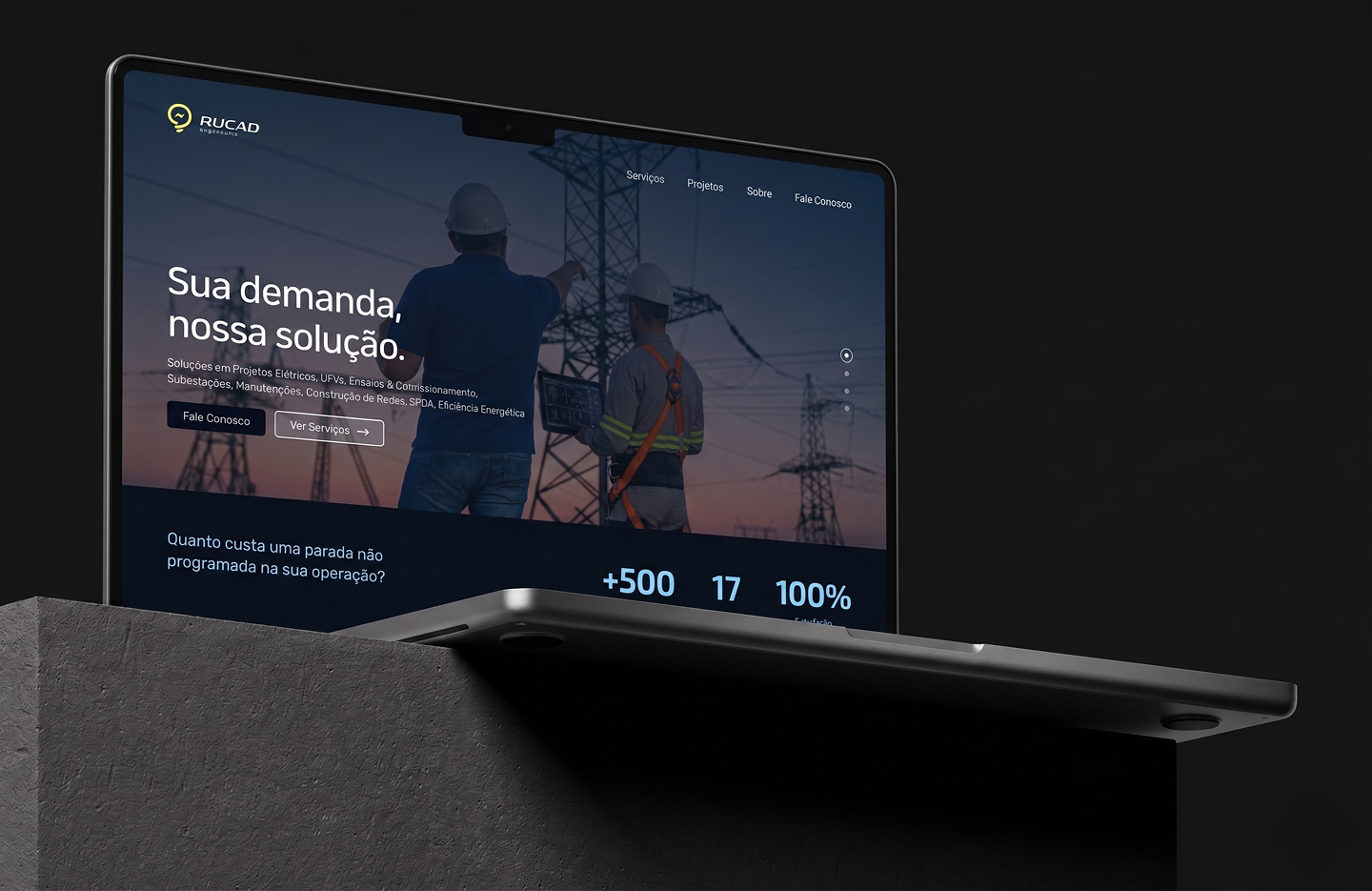
A company changing the level it operates at, with an identity that still read as a smaller local operator. Uma empresa mudando o nível em que opera, com uma identidade que ainda parecia a de um operador local menor.
Rucad Engenharia is a Brazilian electrical engineering company working in industrial projects, technical inspection, and preventive maintenance. It was starting to compete for larger industrial contracts, against more established players, and the brand had not caught up with that ambition. The rebrand had to signal professionalism and reposition Rucad as a serious contender in the industrial market. The company filled out a detailed briefing document, which became the foundation for every decision that followed. A Rucad Engenharia é uma empresa brasileira de engenharia elétrica que atua em projetos industriais, inspeção técnica e manutenção preventiva. Começava a disputar contratos industriais maiores contra players mais estabelecidos, e a marca não tinha acompanhado essa ambição. O rebrand precisava sinalizar profissionalismo e reposicionar a Rucad como concorrente sério no mercado industrial. A empresa preencheu um briefing detalhado, que se tornou a base para todas as decisões que vieram depois.
Solo Brand & Visual Designer, from research and benchmark through logo, palette, typography, applications, social media, and website. Brand & Visual Designer solo, da pesquisa e benchmark ao logo, paleta, tipografia, aplicações, redes sociais e site.
BenchmarkBenchmark
Before designing anything, I studied the competitors Rucad was now up against. One pattern was impossible to miss: almost everyone leaned on yellow. Yellow is the reflex color for the electrical and industrial field, it signals caution, energy, high voltage. And because everyone reached for it, the companies blended into each other. In a lineup, you could not tell one from the next. For a company trying to stand out among bigger players, looking like everyone else was the exact problem to solve. Antes de desenhar qualquer coisa, estudei os concorrentes que a Rucad agora enfrentava. Um padrão era impossível de ignorar: quase todos apostavam no amarelo. Amarelo é a cor reflexo do setor elétrico e industrial, sinaliza atenção, energia, alta voltagem. E porque todo mundo recorria a ele, as empresas se misturavam umas nas outras. Num lineup, não dava para diferenciar uma da outra. Para uma empresa tentando se destacar entre players maiores, parecer com todo mundo era exatamente o problema a resolver.
Core decision, yellow but not the way everyone uses itDecisão central, amarelo mas não do jeito que todo mundo usa
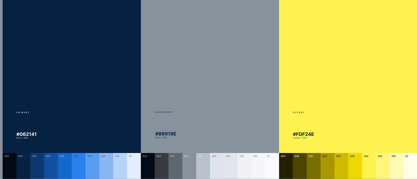
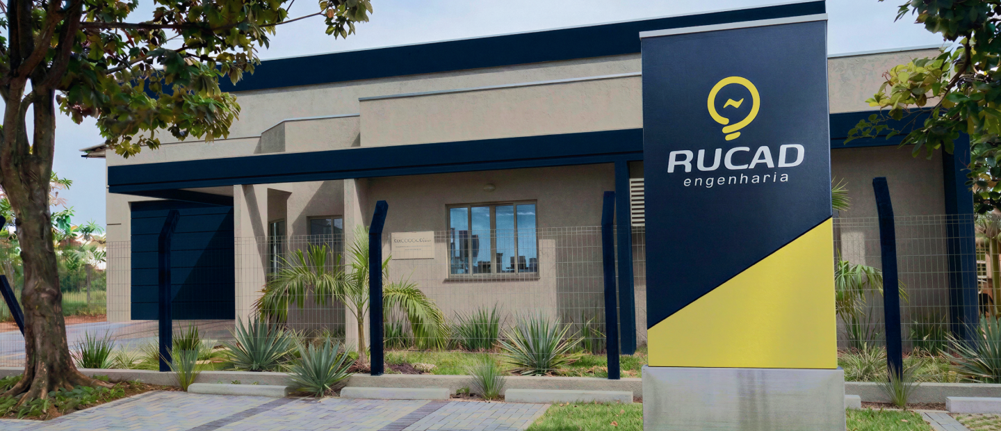
The briefing had flagged yellow as an important color for Rucad. It carried meaning for them and they wanted to keep it. That put two goals in tension: keep the yellow the client asked for, and don't disappear into a field already saturated with it. My decision was to flip the hierarchy. Instead of leading with yellow like the competitors, I made its complementary color, blue, the primary. Yellow stayed, but as the support color, not the lead. O briefing sinalizou o amarelo como cor importante para a Rucad. Tinha significado para eles e queriam manter. Isso colocou dois objetivos em tensão: manter o amarelo que o cliente pediu, e não desaparecer num campo já saturado dele. Minha decisão foi inverter a hierarquia. Em vez de liderar com amarelo como os concorrentes, coloquei o azul, sua cor complementar, como primária. O amarelo ficou, mas como cor de apoio, não protagonista.
-
01
Differentiation.Diferenciação. It pulled Rucad out of the yellow-heavy crowd immediately. Tirou a Rucad da multidão saturada de amarelo na hora.
-
02
Repositioning.Reposicionamento. Blue reads as more modern, more stable, more established, the premium and professional signal the briefing was asking for. O azul lê como mais moderno, mais estável, mais consolidado, o sinal premium e profissional que o briefing pedia.
-
03
Respect for the briefing.Respeito ao briefing. The yellow the client cared about was still there, doing its job as an accent. O amarelo que o cliente valorizava continuou ali, fazendo seu papel como acento.
One decision, made against the benchmark, that answered the briefing's real goal instead of its literal request. Uma decisão, tomada contra o benchmark, que respondeu ao objetivo real do briefing em vez do pedido literal.

Building the identityConstruindo a identidade
-
01
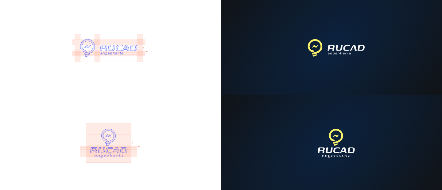
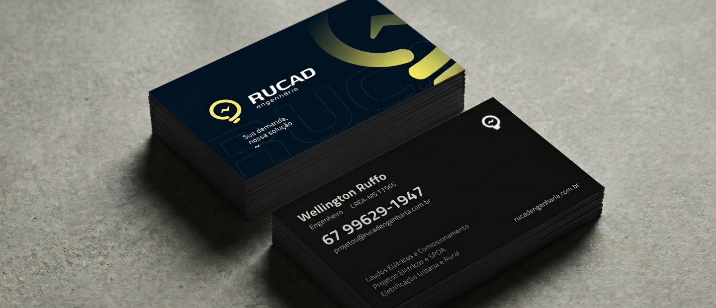
Logo.Logo. Rebuilt to feel cleaner and more solid, sized to work from a truck decal down to a social avatar. Reconstruído para parecer mais limpo e mais sólido, dimensionado para funcionar de um adesivo em caminhão até um avatar de rede social.
-
02
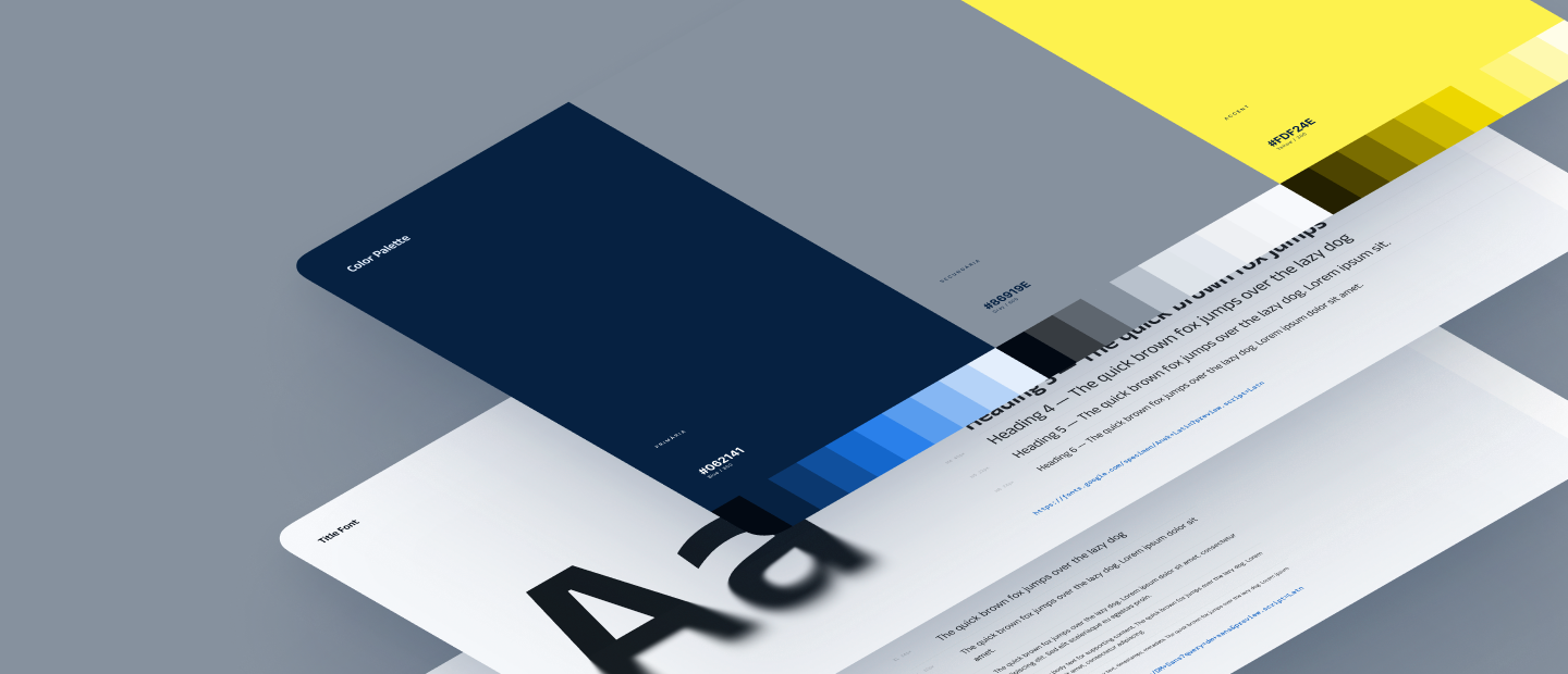
Palette.Paleta. Blue as primary, yellow as support, with a neutral range for professional documents and proposals. Azul como primária, amarelo como apoio, com uma faixa neutra para documentos e propostas profissionais.
-
03
Typography.Tipografia. A type system that holds up across technical documents, signage, and screen. Um sistema tipográfico que se sustenta em documentos técnicos, sinalização e tela.
-
04
Applications.Aplicações. The identity applied across the touchpoints Rucad actually uses day to day. A identidade aplicada nos pontos de contato que a Rucad usa no dia a dia.
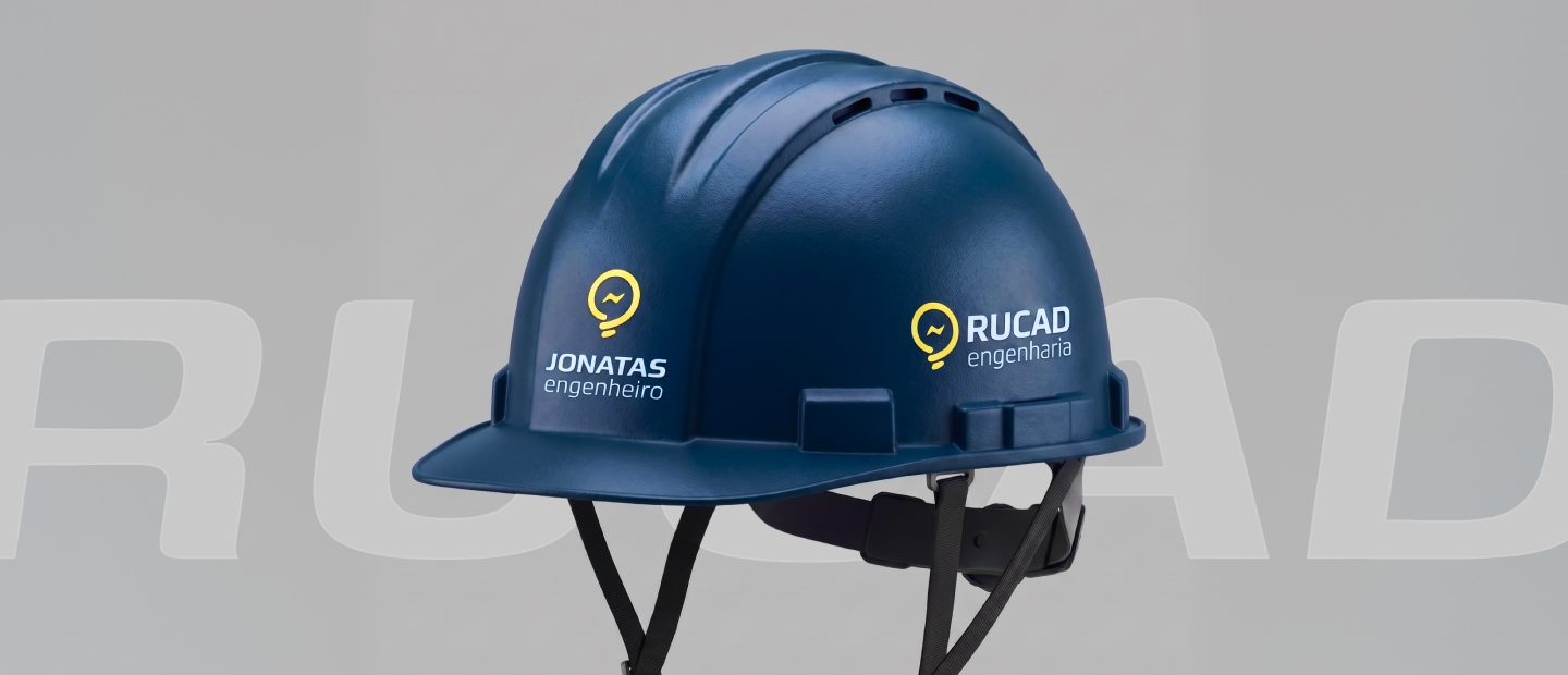
Beyond the logoAlém do logo
The rebrand did not stop at the identity. I carried it into how Rucad shows up publicly: a social media content strategy for Instagram, so the new brand had a consistent voice and look in the place clients would check first, and an updated website to match the new identity and positioning. The goal was that someone meeting Rucad through a proposal, a job site, or an Instagram post would get the same impression: a company that belongs in the bigger league. O rebrand não parou na identidade. Levei para como a Rucad aparece publicamente: uma estratégia de conteúdo para Instagram, para que a marca nova tivesse voz e aparência consistentes no lugar em que os clientes olham primeiro, e um site atualizado para bater com a nova identidade e posicionamento. O objetivo era que alguém encontrando a Rucad por uma proposta, um canteiro de obra ou um post no Instagram tivesse a mesma impressão: uma empresa que pertence à liga maior.


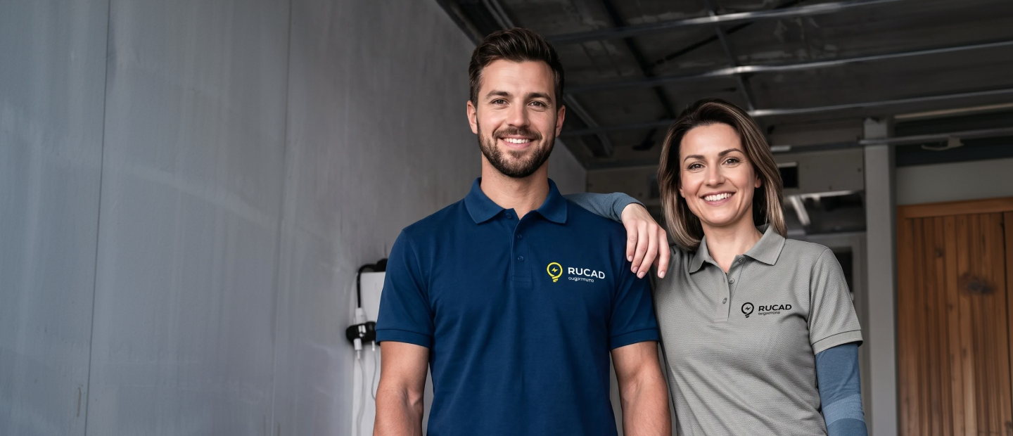
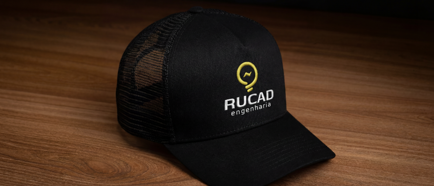
The partners approved the direction, and the brand is being rolled out across the company. Os sócios aprovaram a direção, e a marca está sendo aplicada em toda a empresa.

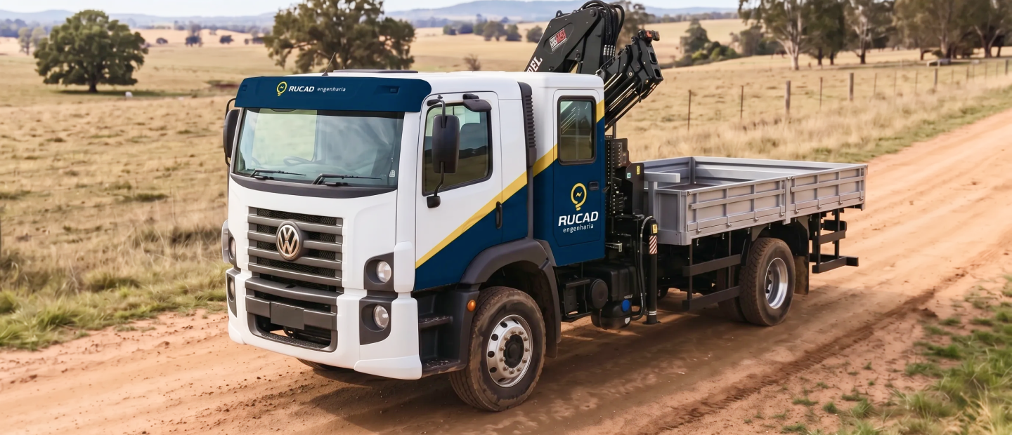
The most useful move was reading the briefing for its intent, not its wording. The client asked for yellow. The goal was to stand out. Those two things looked like the same request until the benchmark showed they were not. Answering the goal, not the wording, is what let a single color decision do the heavy lifting for the whole rebrand. O movimento mais útil foi ler o briefing pela intenção, não pela palavra. O cliente pediu amarelo. O objetivo era se destacar. Pareciam a mesma coisa até o benchmark mostrar que não eram. Responder ao objetivo, e não à palavra, foi o que permitiu que uma única decisão de cor sustentasse o rebrand inteiro.
More workMais trabalhos
-
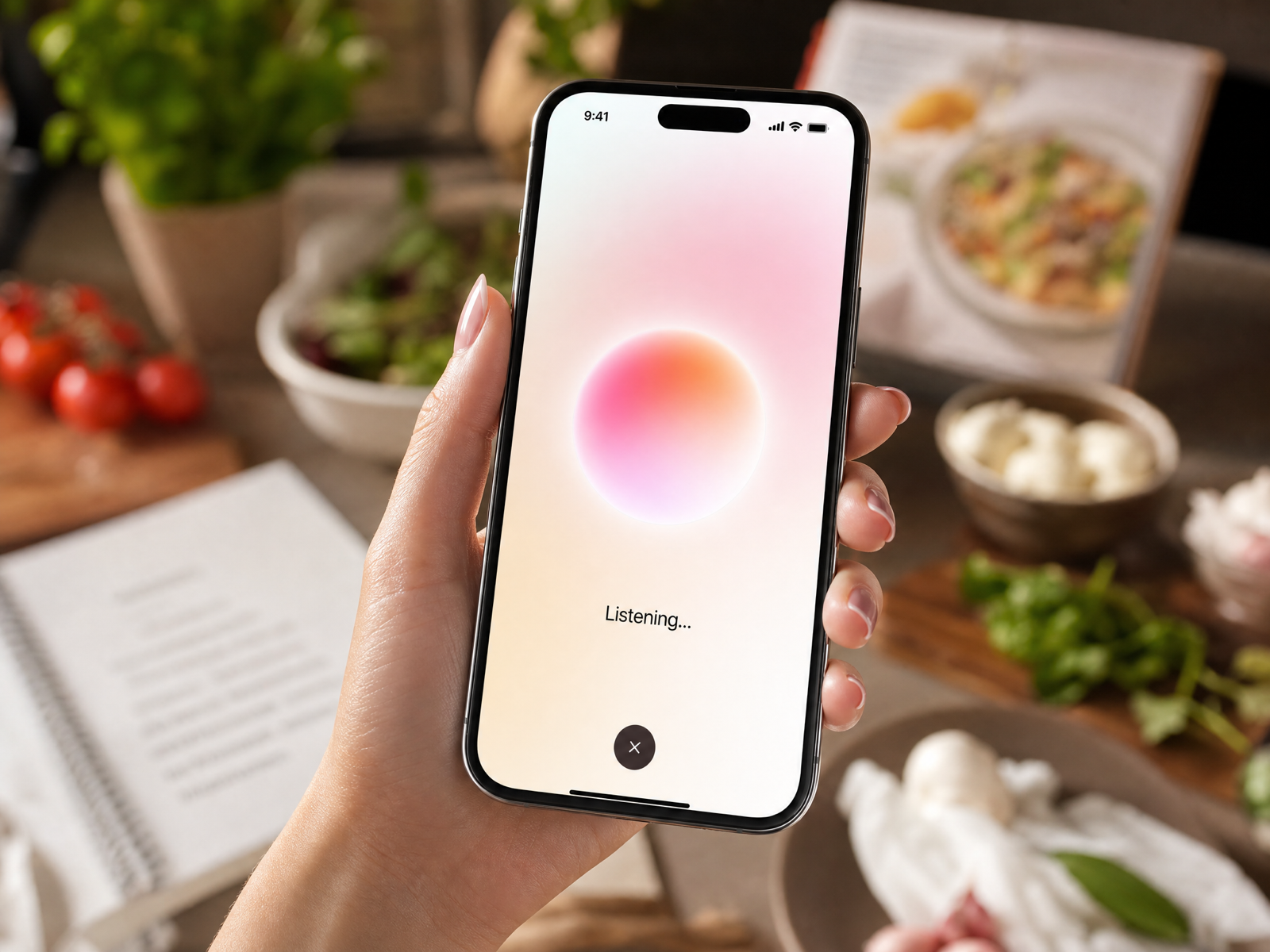
A hands-free start for newbie chefsUm começo mãos livres para cozinheiros iniciantes
-
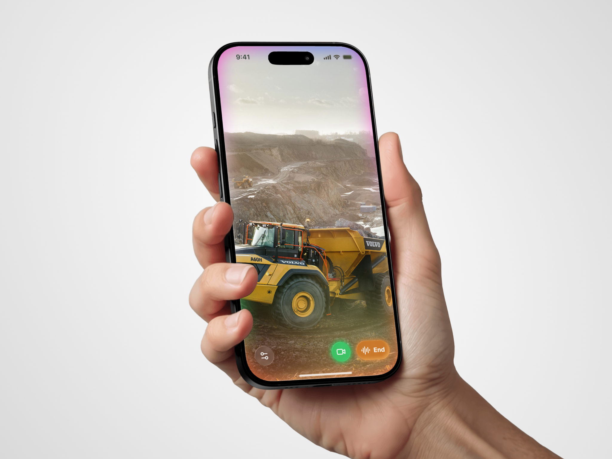
A wearable concept for minersUm conceito wearable para mineradores
-
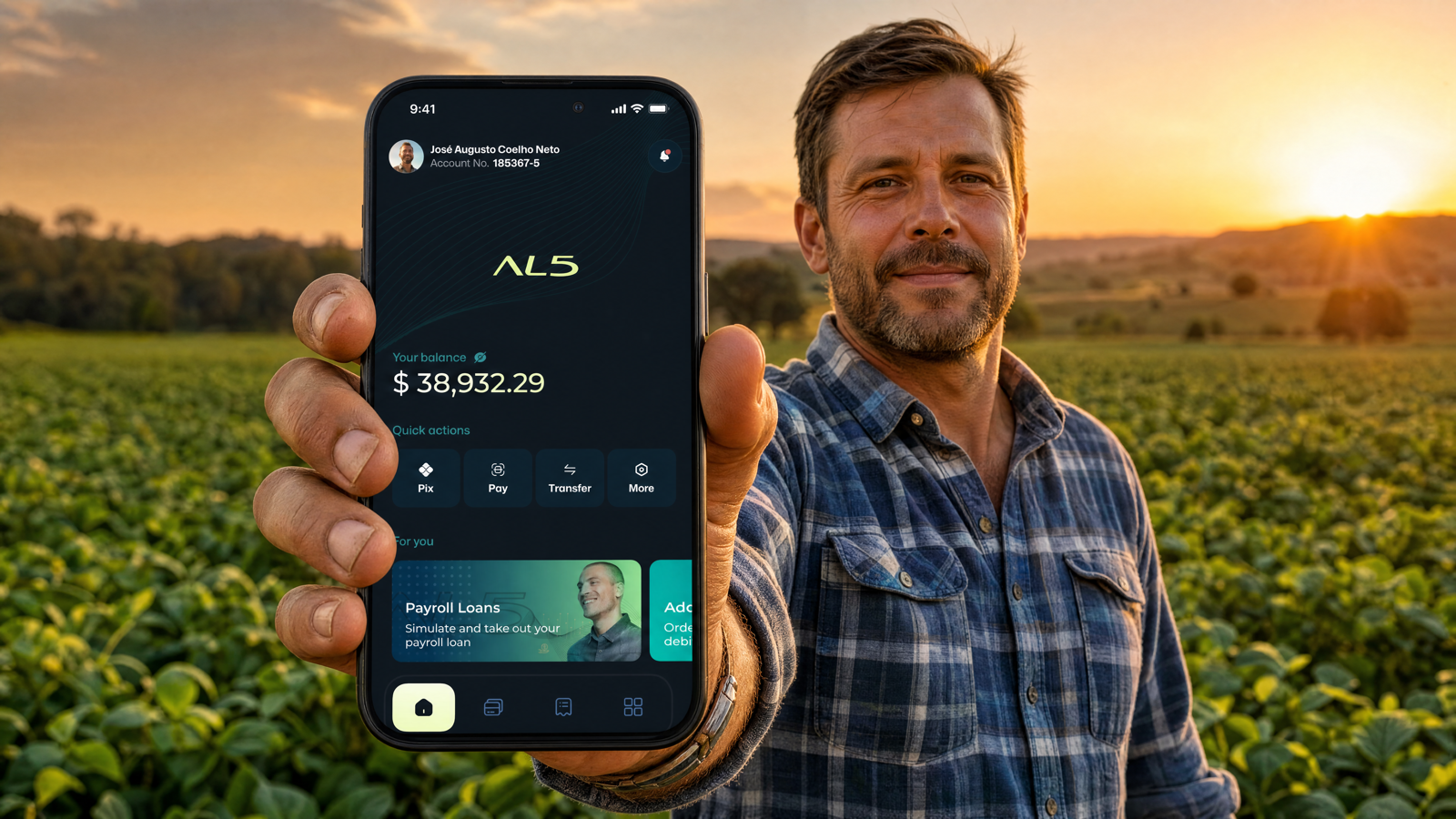
Reducing barriers to account creationReduzindo barreiras na criação de conta
-
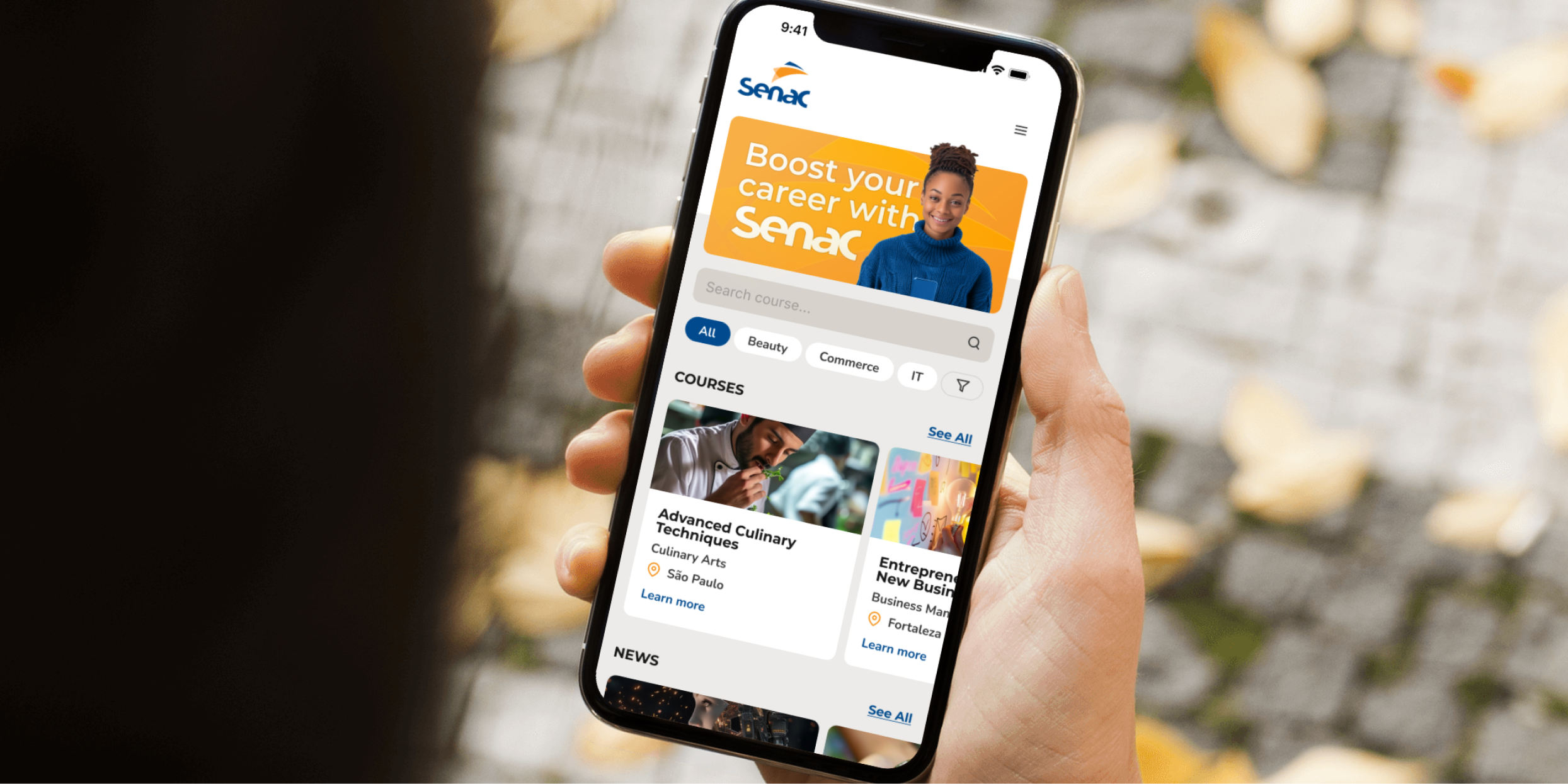
Digital transformation of an enrollment processTransformação digital de um processo de matrícula